Colour is an important consideration when selecting a color palette for interior design, and its importance can be seen in, among other areas, hospitals, whereby the environment largely determines the rate of patients’ recuperation and the effectiveness of work by employees. If the right colors are chosen, one can achieve an ambiance necessary for healing, decrease stress levels, and enhance the patients’ satisfaction. The following is a step-by-step guide for choosing appropriate color palettes for the interior design of hospitals.
1. Learn about Colors
Colors are known to influence the psychological status of people. In the context of hospitals, the first thing that must be considered is the appropriate shades that can help decrease stress levels and transfer positive energy. Here are some key color associations:Here are some key color associations:
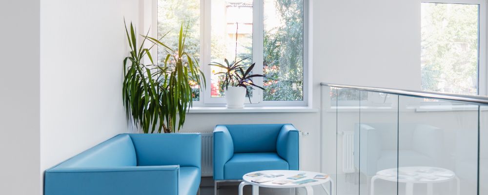
- Blue -: Often associated with calmness and serenity blue is recommended for the use in patient rooms and other waiting areas. These include being able to control, or at least minimize, high blood pressure levels and the capacity to lessen degrees of anxiety.
- Green -: As associated with nature and calmness, green is perfect for halls where the patients stay longer. As a result, it enhances relaxation and comfort.
- Yellow -: Being a bright color, which can definitely bring some mood boosting, yellow should be used sparingly. It can work well in such places as children’s wards or playrooms.
- White -: Is associated with cleanliness and purity and here it is widely used especially in the hospitals. All the same, much of white may be rather bland and uninviting hence can only give the best finishes when complemented by other colors.
2. Consideration The Function Of each Area And Their Relevance
Different areas within the hospital serve various purposes, and the color palette for interior design should reflect this
- Patient Rooms -: It is essential to incorporate gentle and relaxing colors of the tender blue and green shades or other pastel ones.
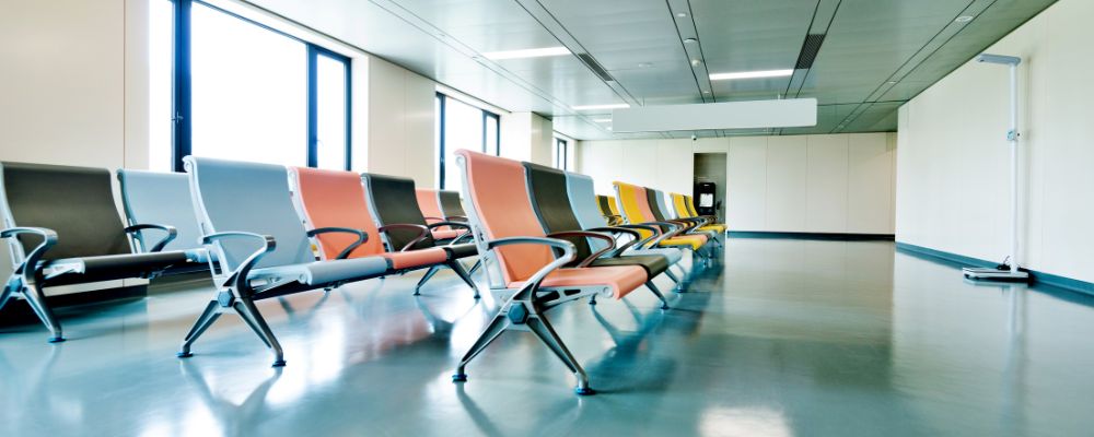
- Waiting Areas -: Choose colours that will not stress you such the soft yellow, beige or any other light colours that will make you comfortable.
- Operating Theaters: Working areas such as operating theaters should be occupied with whites and light blues so as to highlight and emphasize on cleanness and concentration.
- Staff Areas -: Colours that are light such as, light green and blue in the room can help get the morale of the staff up and enhance their effective performance.
3. Incorporate Nature-Inspired Hues
It is also important to integrate parts of nature into the indoors as a way of helping patients as well as the staff. Incorporate nature-inspired hues into your color palette for interior design.
- Earthy Tones -: Blacks, browns, and greens are also very tame and reassuring colours.
- Natural Light -: Bring in big windows and use light colors materials that can reflect light in order to make the interiors appear brighter.
- Biophilic Design -: Organise natural elements such as growing plants and water fountains together with the appropriate colourful combinations that will help in creating an environment favourable for healing to take place.
4. Consult the Stakeholders on Matters
The decision of color scheme to use in interior design should also involve those who are using the place such as health practitioners together with patients, designers, and even manufacturers. Their input can provide valuable insights into the functional and emotional needs of different hospital areas
- Staff Feedback -: Those in the healthcare industry can give practical guidance on the working and care of colors in various domains.
- Patient Preferences -: Patient preferences can create ways to make the setting progressive that in turn makes it more comforting.
- Design Experts: Consult with other interior designers who mostly work on health-care facilities to incorporate an optimal blend of colors.
5. Frequent Updates On The Trends And Standards

The current changes are, however, a common aspect of healthcare facility design, thereby implying that the field is always adapting to changes in the market and coming up with new standards. Stay informed about the latest developments to ensure your color palette for interior design is both contemporary and compliant with industry standards. This is especially important for a healthcare interior designer to maintain relevance and effectiveness in their work.
- Current Trends -: Discover the tendencies of today’s health-care facilities design themes, which, for instance, include soft colors and nature-inspired tones.
- Regulatory Standards -: Make sure that the colors you use are allowed by the laws stipulated for the healthcare facilities as far as the cleanliness and security are concerned.
Conclusion
Choosing the best shade and hue to use in interior design for health facilities is a technical yet enriching process. Knowing color psychology, the purpose of the area, or, in other words, color, its combination with necessary functions, usage of natural colors, involvement of the stakeholder, and the usage of standards and trends, it is possible to develop a healing and effective environment.
We at SkyDec Engineers prioritize patient comfort, safety, and efficiency and provide comprehensive architectural consultancy and structural engineering services to ensure project success.
Contact us today at +91 9818153338 to book consultations and our team will assist you at every step in creating a radiology room or designing a hospital, by following all the important safety standards and regulations.