Ever wonder why colors evoke particular emotions and moods? Your home’s interior designer is greatly influenced psychologically by the colors you pick. Understanding the principles of color chemistry in interior design, including the right color scheme, can help you create the ideal atmosphere in any area. Whether your goal is to inspire affection in the bedroom or promote efficiency in the home office, selecting the perfect color scheme in interior design is key.
Color Wheel
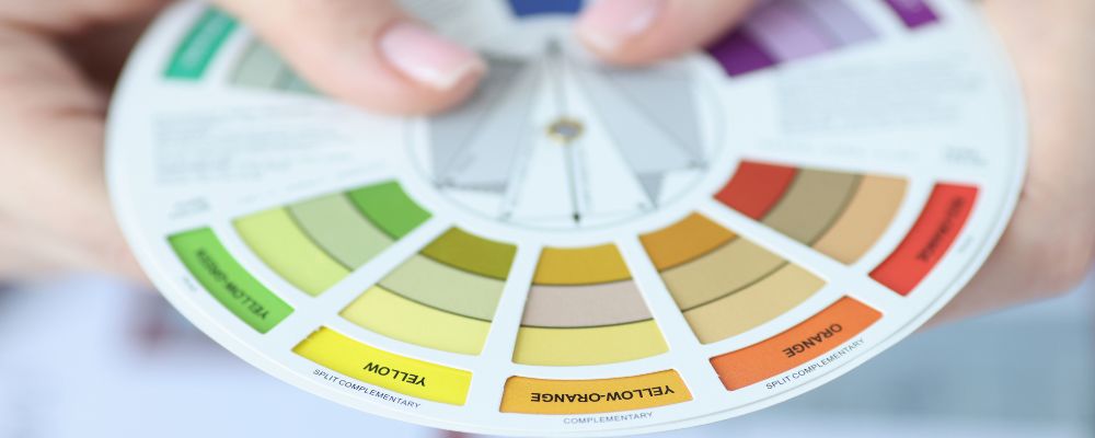
It is a picture of colors organized in a circle to show how they relate to one another. It is an essential tool for comprehending color harmony and contrast in art and design.
Primary Colors
The group of fundamental colors that serve as the basis for all other hues. You cannot mix other colors to make these hues.
Colors: Yellow, Blue, and Red
Secondary Colors
Definition: Colors created by combining a primary color on the color wheel with an additional color that is next to it. Secondary Hues are made by combining two main colors in equal amounts.
Shades -:
Orange (Red + Yellow)
Purple (Red + Blue)
Green (Blue + Yellow)
The Psychological Impact of Varying Colors
- Red -: Exciting, it boosts desire and enthusiasm but also has the potential to spark rage.
- Blue -: Calm and peaceful, it encourages rest and solitude and is frequently used in baths and bedrooms.
- Yellow -: Bright and positive, it promotes creativity and enjoyment and is perfect for kitchens and dining rooms.
- Green -: Balancing and revitalizing, it offers a sense of peace and nature to living areas and bedrooms.
- Purple -: It is a luxurious and elegant color that inspires mystery and creativity. It’s frequently used in bedrooms and other creative areas.
- Orange –: vivacious and friendly, it promotes energy and social contact. It works well in living rooms and workout spaces.
- Neutral colors -: (beige, grey, and white) may be utilized in any environment to balance off other colors since they are ageless, adaptable, and provide a feeling of cleanliness and simplicity.
Understanding Color Schemes in Interior Design
Dark Blue
Dark blue can change things and leave an impression. Often, the finest places to create an impression are little spaces. The area feels larger because of the richer tones on one wall and the lighter, brighter tones used elsewhere. It draws attention away from the cramped area with its strong, gloomy vibe.
Off- White
Off-white paint is easy to deal with since it is such a basic, clean color. The room appears cosier and lighter thanks to the subtle tint. When you contrast it with vivid colors and natural plants, the space also starts to feel larger. Living rooms are good examples of areas where you should normally unwind or have fun since the off-white color scheme makes the space appear cosier.
Clean White
A fresh white gives off the ideal feeling of cleanliness and calms the entire space. Additionally, white is just the proper amount of softness to be considered as comfortable. This is particularly true if you combine it with bright decor and gorgeous timber floors. To add extra energy to the space, try using different color combinations in the plants and furniture.
Dull Grey
For smaller spaces, a deeper grey tone appears contemporary and minimalist. It won’t matter if your furniture is elegant or informal; you can still have a clean, organized look. This is because dark grey offers a unique contrast to the more traditional shades of white or light beige.
Pale Blue
A room might feel bright and airy with the subtle effect of pale blue. When light enters the room through sheer curtains, it creates a calming and attractive effect. It creates a soothing atmosphere in any space when combined with other light hues, such as soft pink and white.
Green Sea
With its elegantly simple vibe, sea green is a widely sought-after hue. Given that the entire space has an earthy appearance, it goes well with wooden furnishings and decor. This relaxes the space and creates a pleasant atmosphere for everyone. You’ll quickly notice how the hue may instantly freshen up the space if you design with other natural tones and textures.
Earthly Ochre
The warm, earthy hue of earthly ochre has a calming effect. The space seems larger due to its subtle brown colors and the sunlight coming in via the open windows. Just by using warmer, visually pleasing colors, the area will appear cosier.
Light Green
Amazingly vivid light green goes nicely with white to make a room feel larger. It can give a space a very lovely contemporary touch and make everything appear cozier and more welcoming.
Black Charcoal
When used as a complementary hue to a lighter primary color scheme, a dark charcoal black can provide the impression of intimacy rather than discomfort in a space lacking natural light.
Taupe
Since taupe is on the lighter side of the color spectrum and provides a more vibrant alternative to tans and whites, it’s a great choice for tiny spaces.
Seeking Ideas And Color Schemes To Design Your Interior?
If you want to design or renovate your living space and find it very confusing what to choose and what not to let us SkyDec Engineers help you out as our highly skilled team will help you achieve your dream results.
Contact us at 9818153338, and we will help you design your space according to your demand and the latest trends.